Work > Case Study
Plains Edge
Plains Edge is a financial consulting firm based in Manitoba. They work primarily with non-profits as a contract chief financial officer on an interim or long term basis to provide financial strategy and tools for the future.
Pat, the owner and sole proprietor, is originally from Black Forest, Germany, while his wife is from Manitoba. They wanted their brand to encompass where they came from and who they are together. The logo draws inspiration from their story and combines a simplified dark forest intersecting with a flat prairie — at plains edge.
Services
- Logo
- Brand Identity
- Tagline
- Business Cards
- Website
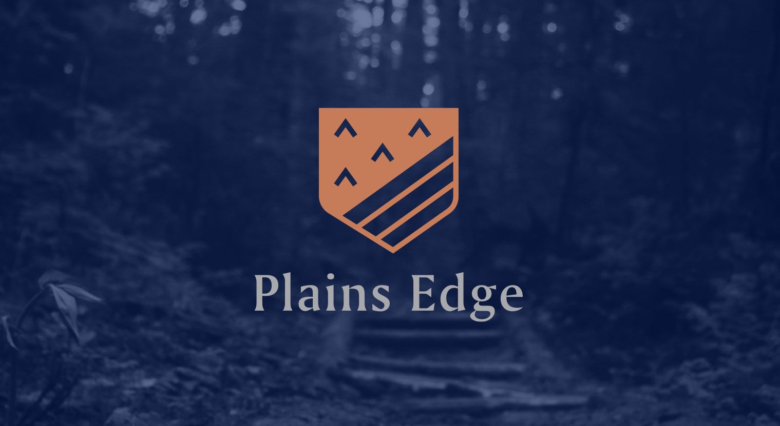
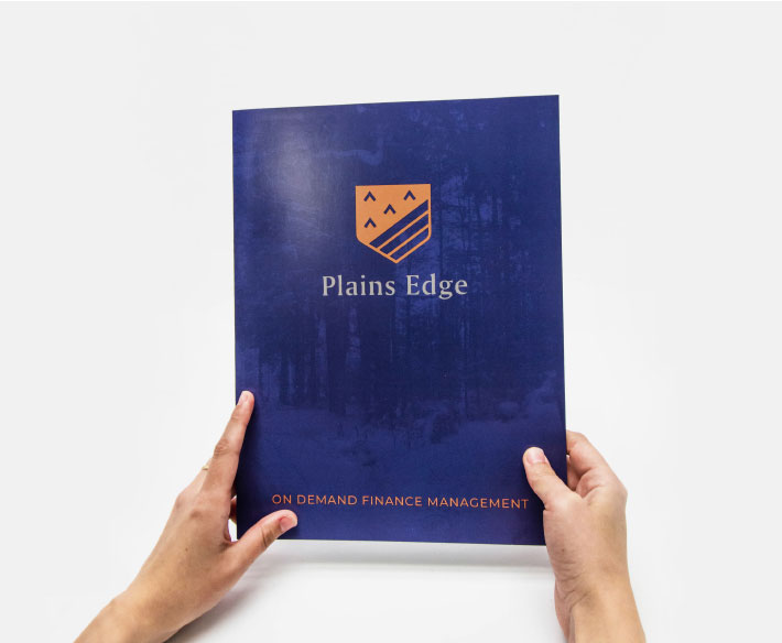
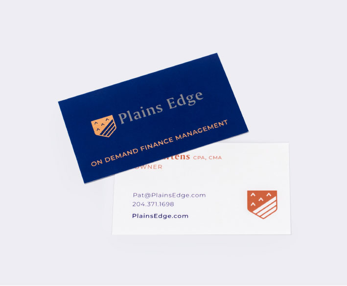
The landscape imagery symbolizes how they move their clients from darkness into light (providing financial clarity), bringing warmth to a traditionally sterile and technical field. Their business cards featured a rose gold foil and soft touch laminate to help convey the high end CFO consulting they provide.

As a business that works with prestigious clients, the Plains Edge logo features a unique serif typeface to bring a refined and poised energy to the brand. The colour combination of the royal blue and bronze reflect the nature of their quality and detail-oriented work. A shield icon was used for the logo to show trust and security over every financial situation.